Project brief: Create concept designs, validate demand for the product concept with users and publishers, identify design issues, and iterate.
Methods: Prototyping, In-depth Interviews, Formative usability testing.
Tools: InVision, Sketch.
Team: Myself (UX Research) + Engineers
UX Strategy
To gain some initial traction in the market, we conceived Project Magnet as an application and content publishing platform aimed at city dwellers to help them connect to stories and experiences around their city. We wanted to bring a sense of adventure and a thrill of discovery back to urban exploration. In defining the initial UX of the Magnet app, I took inspiration from platforms such as Pokemon Go, museum guides, and Geo-caching to help users discover, navigate to, and explore stories that were linked on physical locations in the city.
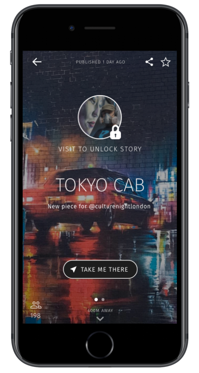
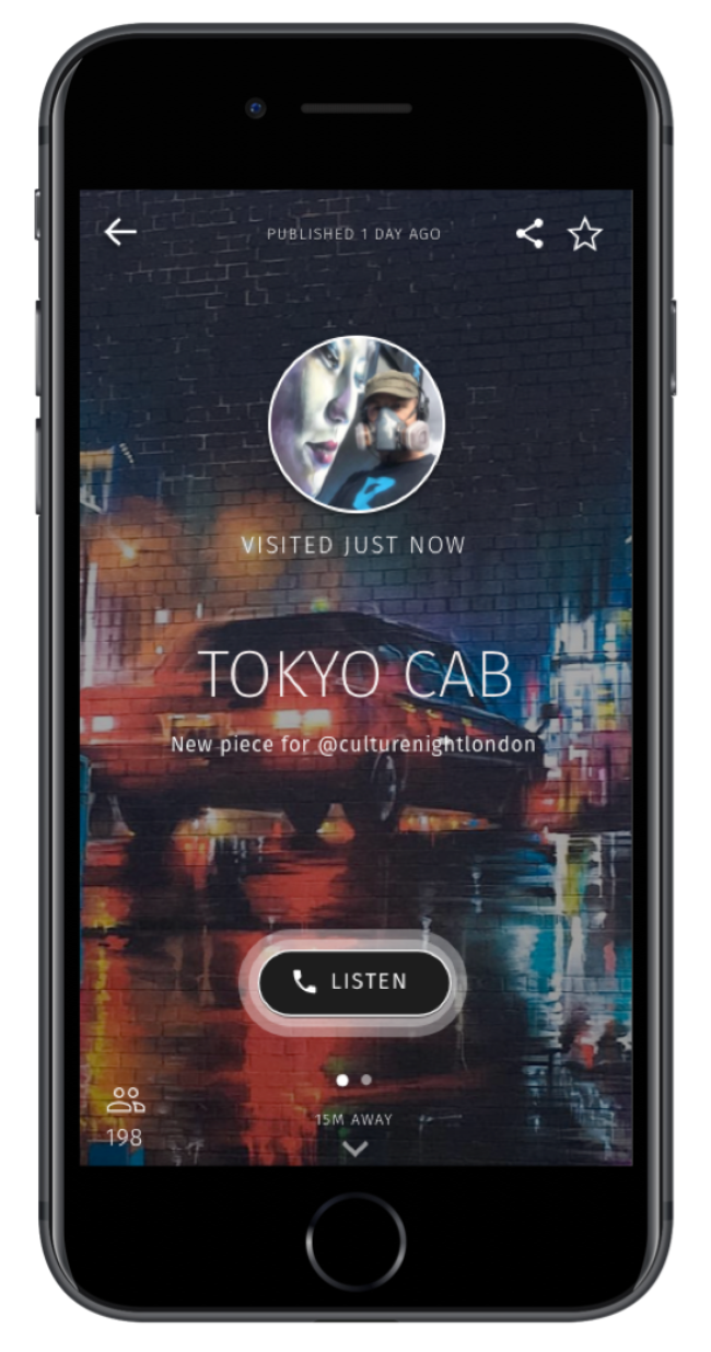
To increase engagement, stories were designed to be short and audio-visual, similar to a museum guide.
To create a sense of adventure and exploration, stories were only unlocked when a user came within a short range of the physical location that the story related to.
Initial Concept
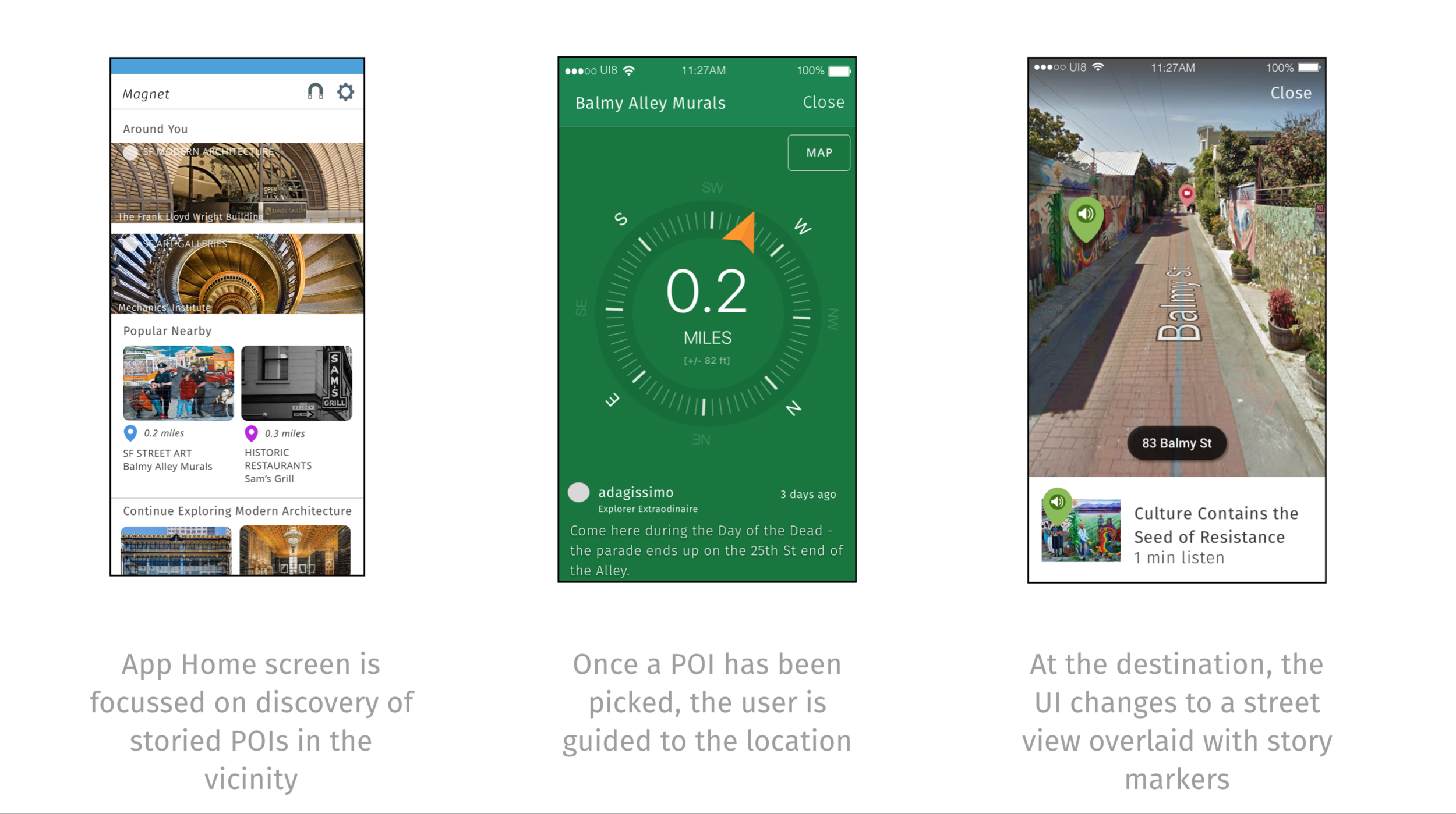
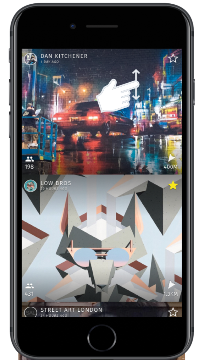
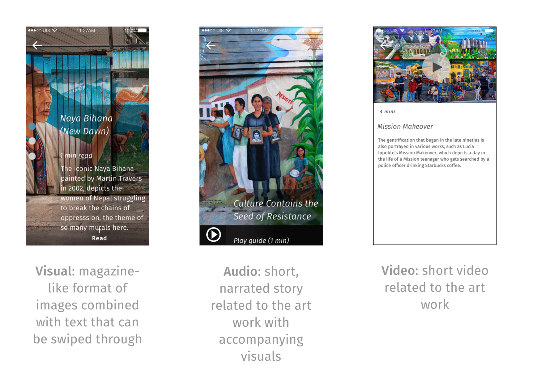
Story Types
Concept Testing
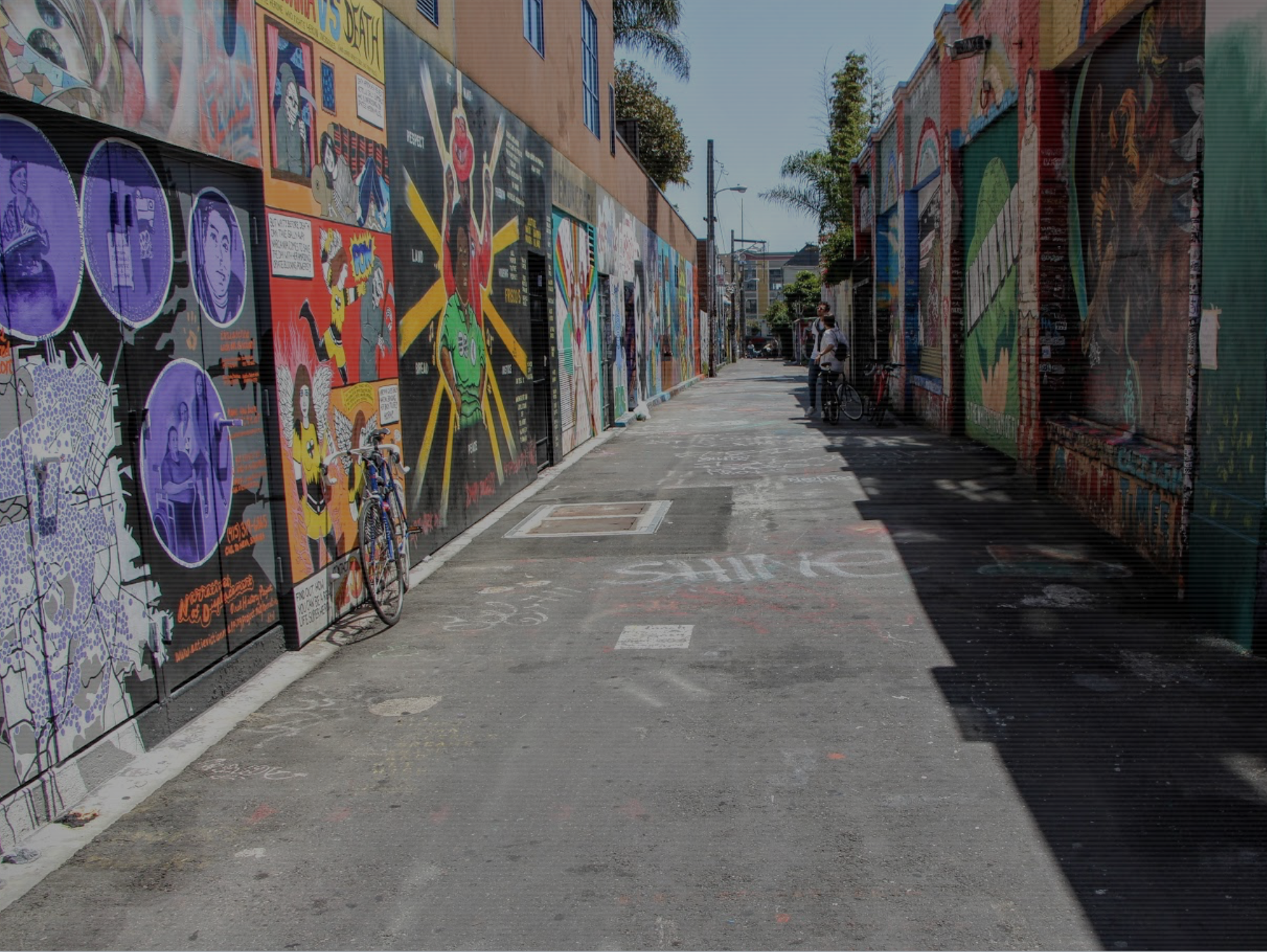
The initial concept was prototyped using InVision and tested with locals in San Francisco.
The prototypes contained stories about street art at Balmy Alley in San Francisco and testing took place at the location to simulate actual usage.
Feedback on Concept
“I’ve lived in the city all my life and I’m just now exploring it... I’m just now realizing how nice it is. I’d go on dates and stuff and we’ll walk around I’m like ‘damn, I’ve never seen this before’. And I live right here, you know? Obviously I’m missing something… I should know more. I’ve lived here all my life and I barely know anything”
Our interviews revealed that our initial assumptions that locals have problems in exploring their own cities had some merit. We heard about a number of struggles that participants had in finding interesting things to do either alone or with friends. They might turn to Google search, or to Yelp, but found that much information is geared to tourists - they wanted to connect to knowledge from local experts, to get out of their routines, and to feel like they really know the city that they live in.
Participants liked that the prototype pointed them to an experience that they wouldn’t normally have thought about or could easily find out about - in this case, about street art. They found the interaction style using the street view to be fresh and interesting, although they hated the use of the compass to get to places as it felt inefficient and potentially dangerous if they were wondering around in an unfamiliar part of the city.
As for the stories themselves, participants preferred the audio content on the prototype as it worked best in a real world, outdoor situation. They liked content that helped them understand about the artist who painted the street art and why it was painted, as it gave them a feeling of being connected to the place.
Designing the Next Iteration
The feedback on the concept led us to revise the overall experience to focus on solely on audio content. This also had the benefit of simplifying development for an initial MVP. To simplify the product even further, we also decided to focus the app solely on street art for an initial launch to get further feedback from users and content publishers.
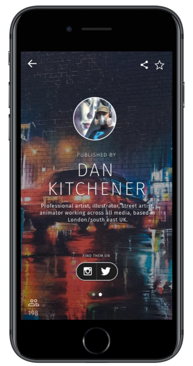
Before designing the next iteration, we also ran a series of interviews with street artists to get their initial feedback on the concept. They were excited by the concept as they saw it as a way to promote and tell the story of their work, but wanted more ways to connect with their audience and understand what kind of impact it made on them. This led us to make some further changes for the next iteration to give greater credit to the artists and to provide links to their social media platforms.